You can use the 2D chart to see a quick overview of how managers and employees see themselves. The tool can even be used to analyze outliers or spot imbalances in how managers assess their teams. While it’s by no means a scientific measurement, the placement of the dot strongly correlates with what employees and managers write in their assessments.
Graph Overview
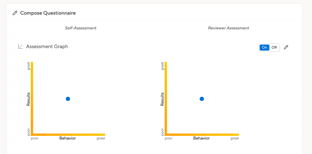
You can enable the graph as you set up your performance review questionnaire:
9-box grid option
We do not offer a traditional 9-box grid option but we do offer a way to achieve this using our 2-D graph. To achieve this, just ask our team to customize your graph to 9 boxes and enable our optional grid feature.
With this customization, your 2-D graph will look like this:

You’ll of course be able to then customize the information boxes on the x-axis and y-axis to provide more information on using your graph to align with the 9-box grid model.
Viewing your graph results
Once people have written their reviews and depicted their performance on the 2D chart, managers can visualize their teams’ performance on a single graph. Managers of managers will also see their indirect reports, and HR staff will see the entire company’s performance assessments in a single graph.

On the left, you see the graph of performance assessments. In the sidebar on the right, you can pick whose data to display, and at the top, you can choose if you want to see employee self-assessments, manager assessments, or a combined view to compare the two.
You can hover your mouse over any icon to increase its size and display the name of the person it represents, and you can click on an icon to load the text of the corresponding review at the bottom of the page.
Choosing who to display
This tool gives you the powerful capacity to select different sets of employees to display on the graph – examining how subsets of employees are placed on the chart will help you pull useful information out of the data you’ve collected. Use the organizational list on the right side of the screen to choose the set of employee reviews to display.
You can select and deselect teams and individuals, you can collapse the org chart to display only a few layers in your reporting structure or you can expand it to display all employees. You can choose to display employees’ names in the chart or hide them (if you want to see many data points at once).

Color the teams to spot imbalances between manager’s assessments
All managers should use a common metric to rate their teams. You need to communicate with managers before the review process to ensure that employee A will get similar feedback and/or ratings as employee B for similar work. Of course, it’s tricky to verify that managers’ ratings actually do align.
Reading dozens of reviews may not be feasible. But since the manager’s dot placement will typically correspond with what they write, you can use the 2D overview chart to spot certain trends.

Coloring the teams. Can you spot whose team got better feedback?
When you hover your mouse over a team’s manager in the hierarchy, that team’s members are highlighted in the chart. You may see certain issues right away. To compare two or more teams, you will want to assign a different color to each team.
Just click the little “color ball” next to a manager’s name, and their team will be assigned a random color, both on the tree view and in the 2D chart. You can do this for multiple teams, and certain trends or potential issues may become obvious right away.

Keep in mind that the dots can only help you identify potential underlying issues. But the presence of a team with suspiciously higher or lower ratings doesn’t in and of itself indicate that there’s a problem with the way their manager rated that team — maybe some other factor caused that team’s ratings to differ. It wouldn’t make sense to simply recalibrate that team’s ratings without figuring out why those people were assessed differently, and working with the managers to solve the issue.
If the problem did turn out to be manager bias, a good solution would be discussing the issue with that manager, who could then adjust the actual written feedback. Only then should you think about moving the dots accordingly.
Manager view vs employee view
There are three tabs at the top of the 2D chart. The first displays the manager’s assessment, e.g. how a manager rated the employees. But you may want to see how a person assessed his own capabilities. Switch to the Employee view.
Once you feel comfortable with these, the comparison view shows both assessments at the same time, linking an employee’s self-assessment to their manager’s assessment with a fine grey line. Hover your mouse to over an employee to highlight their assessments. Since the comparison view will contain twice as many user icons, it is crucial to first filter the data you want to display using the org chart on the right.

It is not surprising for employees to give themselves better ratings than their managers do. This is normal. It’s only problematic if the assessments differ wildly. It’s up to you to decide how far apart they can lie. In the screenshot, Stan’s self-assessment is much further away from his manager Mark’s assessment than any other pair — in this case maybe Mark’s manager or someone in HR would want to call a meeting with Mark and Stan.
Fine print
Note: HR staff can see manager assessments even before the manager has shared the assessment with their report. This is important because it enables HR to compare the ratings of managers before the managers share their assessments with their teams. Managers are not perfect, and maybe rating team members according to different scales.
You as an HR staff member should try to encourage the managers to use similar scales. You don’t have to apply forced ranking to achieve this. Often all it takes is a simple honest discussion with the managers, showing them how differently they rated their staff. Often, this will be enough to start a discussion in which managers adjust to align their expectations of staff performance.
The 2D dot is a subjective tool, but it may be helpful to think of it this way: if the dot is in the middle, then that means the person has done a good job based on what his role and seniority would indicate.
If a person did better than expected, the dot belongs more towards the top right corner, and if the person didn’t quite achieve what could have been expected of him, then it should be more towards the bottom left corner.
Discussing with your team across departments what the dot or rating means to them, helps to align the rating in order to compare results across teams. If your staff still feel unsure about it, you can disable the results/behavior graph in the settings for the performance review.